Kürzlich ist das neue Album der COLD WAR KIDS erschienen, die mit LA Divine eine neuerliche Wendung im Sound vollziehen, hin zu kalifornischem Neon-Hochglanz – und nichts könnte das besser ins Bild übertragen als das Cover-Artwork. Art Director NATHAN WARKENTIN hat uns zu seiner Arbeit denn auch Folgendes erzählt:
The theme of the record and the artwork are very intertwined. We wanted to tell the story of Los Angeles, or at least one story, highlighting both the strange and the beautiful.
We worked with photographer Dan Monick who happened to be exploring many of the same themes in his work. He was actually the first photographer to shoot the band for a magazine years back and has a studio right next door to Maust’s. It just made sense to work with him.
I have been a close friend of the band since before they started and we have collaborated creatively on a few things music and art in the past. We worked very collectively on the album art, using Monick’s photographs as the foundation.
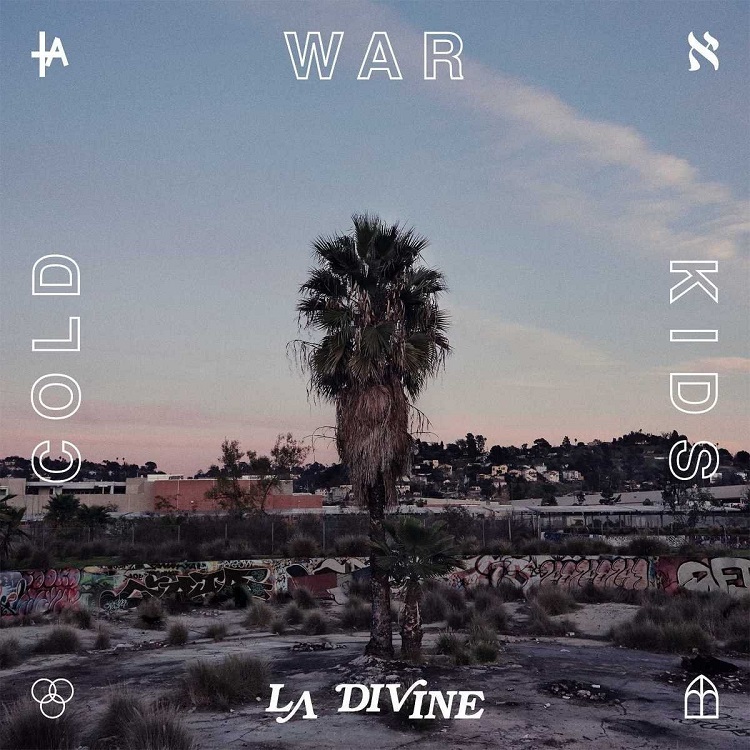
The cover was shot on the L.A. river not far from Willett’s house. A palm tree is such a familiar image, almost synonymous with Los Angeles and equally overused. But we loved how it was re-contextualized in such a strange setting.
COLD WAR KIDS-Sänger NATHAN WILLETT ergänzt ausführlich:
Dan Monick’s photos were really the perfect companion to our side of LA that we wanted to show. Coyotes, house parties, a lonely beautiful palm tree. They all feel sad and beautiful, isolated and free… Poetic stuff. Dan’s photos have a sort of pastel palette that feels like a fresh look for us. Once we knew we had access to his whole catalogue, we knew we had plenty to work with for this record.
Every photo really has a specific relationship to the song lyrics that accompany it. (We actually did sort of a similar thing with our Loyalty To Loyalty record.) The picture of Carmen Electra taking a selfie at an art show really became our favorite of all. It just feels so strange and perfect. So shamelessly self aware and yet totally unaware of her environment.
Warkentin really brought it home with the cover design. I love the four symbols, there is one that looks like a cathedral or a mosque – a place of Worship… There is the LA symbol, that kinda looks like LA dodgers, but has a cross in it. The three circles are kind of the spirit or divine…
The Aleph that looks like an N – is my favorite. This one to me really represents „Love Is Mystical“. I saw it in a book of Wallace Berman art book… It is Jewish / Kabbalah, being the first letter of the hebrew alphabet i believe, and i think is supposed to show God’s infinite nature… Berman used it because as a kid he would walk around LA on Fairfax and see that symbol on the Jewish centers.
I love that re-assigning of meaning to an old symbol.
COLD WAR KIDS
LA Divine
(Capitol / Universal)
VÖ: 07.04.2017
www.coldwarkids.com | www.dmonick.com