Für unsere Cover Art-Reihe haben wir BRITISH SEA POWER-Sänger YAN SCOTT WILKINSON um ein paar Takte zum Artwork des neuen Albums Let the Dancers Inherit The Party gebeten – und einen zweiteiligen Essay bekommen, Fußnote inklusive. Hier in aller ungekürzter Pracht…
Stage One. Where the idea comes from
The first seed that would grow into the idea for LTDITP album art was at a Willem Sandberg exhibition sometime before the album and most of the songs exhisted. It was a beautiful exhibition and it some how seemed incredibly new and modern compared with much of todays design. It also seemed to have a lot of humanity and emotion despite there being barely any images. Just colour and textures and a sensitivity. I also liked the fact he had rules that he mostly stuck to.
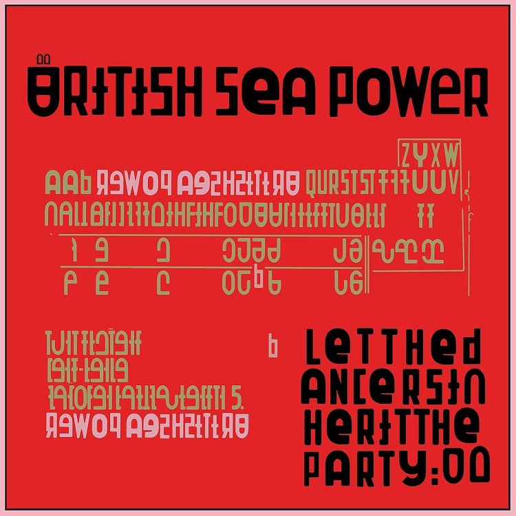
Later on the album was all but completed and I had offered to provide suitable artwork although I really had no idea what it should be. On some level I think there should be a genuine strong if nebulous link between the visual and the music. Sometimes this link does not present itself as soon as would be ideal and I was running out of time. I had looked often at Ian Hamilton Finlay which is where the album title comes from. I am a big admirer of his but for one reason or another this line was fruitless. I tend to be on constant relaxed alert waiting for the right moment when some kind of image falls into my lap usually when I am close to giving up. I was watching a couple of Peter Saville interviews and was quite engaged when I clicked on a typography filmed university lecture on European typography. It reminded me of studying Typography at Reading University and I listened a bit then flicked through the images until a page of experimental typography in the form of an alphabet that I didn’t recognise but was somehoe aware of caught my attention. It turned out to be Kurt Schwitters system schrift. The discovery of this seemed a fantastic coincidence as Kurt Schwitters has played an increased influence on me and intersected with the bands life.* The fact that the font Schwitters designed was musical in nature was perefect and a stroke of luck . It was perfect really. I am fascinated by the concept of collage and to some degree dada and even surrealism to a degree. I see it reflected in William Burroughs and of course Bowie etc.. It is a tremendously rewarding way of working and thinking. Thanks yet again Kurt!
* over the last few years we have visited and been in touch with Ian Hunter who does a remarkable job at the Merz barn in Ambleside. We have been trying to put together a collaborative project to celebrate Kurt Schwitters and also related to his position as a “deviant” artist as described by the Nazis. I also too part in a Late at Tate night about Scwhitters where I contributed a sound/visual installation piece using “Ursonate” and the condemnation of deviant art as inspiration.
Stage Two. Putting it all together
Having provided the album cover it was now time to collaborate with Woody, our drummer who is also a talented illustrator, is meticulous,and has great design skills. He also has a more professional level of skill with software such as photoshop than me.
We decided it would be best to adapt the Schwitters based Architype Schwitters fontfor use through all the artwork. In this way way we would have our own unique if not original font with a few added quirks. We would have several different choices for some letters and a variety of non letter characters that could be used. I wanted to include some random or seemingly random artifacts as well as embracing the non perefections of the system schrift prototype. Woody put the font together with these rules in mind which then allowed us to experiment with using the type for layout. We decided we wouldn’t use images but the font would do the work instead. We would maintain a limited colour palette. We would embrace the use of blocks of colour and type layout that was not done to be easily read as the prime motivation. The first thing was reflecting in some way the nature or pattern of songs and the allowance to be stupid basic and even childish. It shouldn’t be too easy to read the lyrics was one guideline. Or at least it doesn’t matter if its hard.
So having done the cover and a kind of verbal agreement on what the formula/rules of the design concept were in place and with Woodys adapted font, we would send ideas back and forth at first. I had 3 or 4 pages that I initially sent by email to Woody. He then began sending more and more back. Often it was finished and looked great. Other times I would suggest a change or send a different idea back. He was very good to work with and it was a pretty quick and easy going relationship for work. Gradually woody put together the design files for the various formats. The most fum ones for obvious reasons are the double gatefold and box set which contains sevaeral cds and a booklet. My favourite design in white was reserved for the box set which was bought by fans who helped fund the album. We wanted to give them something very special they would appreciate. It would be mostly white/light grey but inside contain lovely colours .
As the project went further along I rarely had to generate ideas but would just give the odd nudge to the work Woody was producing. Overall he does more of the technical work and I do the initial creativity but there is quite a blurred boundary and we both cross it regularly. We make the most of our different skill sets and have some common ground also. I personally would struggle and probably fail if I had to take the artwork to a printable finished solution ready to go off to the printers. Also having Woody to proffesionally and accurately lay out the covers and various pages and labels leaves me much needed time to get on with inevitable new demands such as the next single cover art or a video etc. Since we do a lot of the jobs that other bands farm out it is a pretty busy life being a musician.
BRITISH SEA POWER
Let the Dancers Inherit The Party
(Caroline / Universal)
VÖ: 31.03.2017